

You may see a bitten apple on a device, three stripes on a shoe, or an orange arrow beneath a word and recognize the company immediately, even before reading its name.
That is where the power of a logo lies.
A logo is not merely an aesthetic element; it is a visual shorthand for the brand that helps consumers recognize and remember it and associate it with specific products, experiences, and qualities.
Some logos may appear simple, but behind them are marketing and design decisions that explain how a company wants consumers to perceive it.
Baskin-Robbins: 31 Flavors in Two Letters
When looking at the Baskin-Robbins logo, the numbers 3 and 1 appear within the letters “BR.”
The number 31 is linked to an idea the company adopted in the 1950s: offering 31 flavors, one for each day of the month.
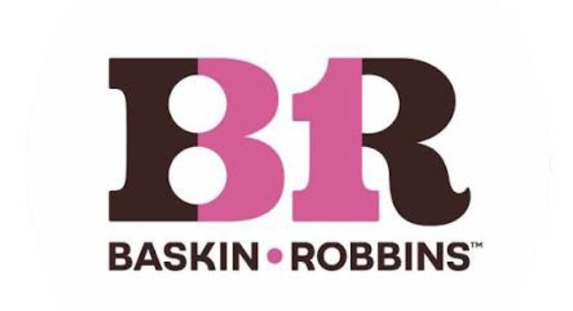
The number was not merely a hidden detail; it distilled the value the brand wanted to stand out for: variety and choice.
This is one of the functions of a successful logo: it does not only tell consumers the company’s name; it can also remind them of a different reason to choose it.
Amazon: From A to Z
The orange arrow in the Amazon logo may initially look like a smile, and it was indeed designed to create that impression.
But the arrow also extends from the letter A to Z, alluding to the idea that Amazon wants to offer a wide range of products, from the first letter of the English alphabet to the last.

This logo became especially significant as Amazon evolved from an online store that initially focused on selling books into a platform offering multiple product categories.
Here, the logo changed in parallel with the company’s own message: it no longer wanted to be known as a bookstore, but as a destination where customers could find almost anything they were looking for.
The small arrow thus became shorthand for a huge business idea: variety combined with customer satisfaction.
Why Is the Apple Bitten? Apple
The Apple logo is perhaps one of the logos surrounded by the greatest number of different interpretations, from linking the bite to the computing term Byte to other philosophical stories.
But logo designer Rob Janoff explained that the original reason was much simpler.
He added the bite so viewers could tell that the shape was an apple rather than another fruit, such as a cherry.
This story reveals an important lesson in design: not every detail needs to carry a profound philosophical meaning.
Sometimes easy recognition and clarity are the logo’s most important functions.
Over the years, the apple itself became so recognizable that the company no longer needed to write “Apple” beside it.
This is when a logo reaches another level of power: the symbol alone becomes sufficient to identify the company

Speed in the Form of Puma
Puma chose the leaping puma to be part of its visual identity.
The connection here is direct: this animal is associated with speed, agility, and movement—qualities that in turn align with the athletic products the company sells.

In this way, the logo does not merely display the brand name; it helps build the mental image the company wants consumers to associate with the product.
When the image of the leaping animal appears repeatedly on shoes, clothing, and advertisements for years, consumers begin to associate the symbol with movement and athletic performance.
These mental associations are an important element in building brand equity.
Three Stripes That Became the Adidas Brand
As for the three stripes in Adidas, their story is simpler than the widespread interpretations might suggest.
According to the company, its founder Adi Dassler tried different numbers of stripes and found that three stripes were clearer and more distinctive in photographs.
With the stripes repeated on Adidas products for decades, they evolved from a simple design element into one of the world’s most recognizable visual marks.
This is an important point: a logo’s value does not necessarily come from its complexity or from having a secret meaning behind it.
Sometimes the value comes from repetition and consistency.
When consumers see three stripes on a sports shoe, they may recognize the company before they even see its name.
The mark thus evolves from the company’s name into its own visual signature.

Why Does a Logo Have Economic Value?
It may seem strange for companies to invest large sums in designing a relatively small element, but a logo’s value becomes clear when we consider the number of choices consumers face every day.
In a single store, there may be dozens of competing products, while online users encounter hundreds of brands and advertisements.
Therefore, a company’s ability to be recognized by consumers within one second becomes an important advantage.
Over time, the logo represents more than the design itself; it begins to carry everything consumers know about the company.
The apple may evoke Apple products and a person’s previous experience with them.
The three stripes may evoke Adidas.
The Amazon arrow may bring shopping and delivery to mind.
In other words, the logo gradually becomes a vessel that stores the company’s reputation and the customer’s experience with it.
That is why two companies may have two beautiful logos, yet the value of each may be completely different; true value does not come from the image alone, but from the years the company has spent building its products, trust, and customer experience around it.
More Than Just an Image
These logos reveal five different ways to build a brand.
Baskin-Robbins distilled variety into the number 31.
Amazon placed the breadth of its products in an arrow extending from A to Z.
Apple built a simple symbol that can be recognized without writing its name.
Puma used movement and speed to shape its image.
And Adidas turned three simple stripes into a global visual signature.
Ultimately, a logo’s power lies not in the amount of detail it contains, but in the meaning that accumulates behind it over time.
A logo may be the smallest of a company’s elements in terms of space, yet one of the most visible to consumers.
When a brand succeeds in building its identity, it reaches a stage where it no longer needs to explain itself every time.
You only need to see the symbol to know the story.
 Ask Yamami
Comments (7)
No comments yet. Be the first to comment!